You can create a combo box cell with multiple columns in the drop-down list. You can provide a drop-down list as well as an editable area allowing the user to type in values as well as choosing from a displayed list. You specify the list of items, the number that is displayed at any time, and whether the cell is editable by the user.
The Spread control has a ButtonDrawMode property for button cells and combo box cells. This property allows you to always show a button, or show buttons in the current column, row, or cell.
To create a cell that acts like a multiple-column combo box, use the MultiColumnComboBoxCellType class. Create such a combo box cell using the following procedure.
Customizing the Display
You can customize the display of the multiple-column combo box cell by setting the following properties.
| Property | Description |
|---|---|
| BackgroundImage | Sets the background image in the cell. |
| ButtonAlign | Sets where the buttons are displayed. |
| ColumnEdit | Sets the column of the list to use for the edit portion. |
| DataColumn | Sets which list column to use as the data column. |
| DataSourceList | Sets the data source for the list portion of the cell. |
| ListAlignment | Sets which side of the editor the list aligns to. |
| ListOffset | Sets how much the list offsets from the editor. |
| ListWidth | Sets the width of the list. |
| MaxDrop | Sets the maximum number of items to display in the list at one time. |
| StringTrim | Sets how to trim characters that do not fit in the cell. |
| SubEditor | Sets the subeditor. |
Customizing the Operation
You can customize the operation of the multiple-column combo box cell by setting the following properties.
| Property | Description |
|---|---|
| AcceptsArrowKeys | Sets how arrow keys are processed by the cell. |
| AutoSearch | Sets how a list of items in a combo box cell is searched based on input of a character key. |
| DataColumn | Sets which list column to use as the data column. |
| DataSourceList | Sets the data source for the list portion of the cell. |
| Editable | Allows the user to type in the edit portion of the cell. |
| SubEditor | Sets the subeditor. |
Note that some graphical elements in certain cell types are affected by XP themes (visual styles). Setting the VisualStyles property of the Spread component to "off" can allow visual customizations of those graphical cell types to work as expected. For more information, refer to Using XP Themes with the Component.
For more information on the properties and methods of this cell type, refer to the MultiColumnComboBoxCellType class. For more information on a standard combo box (single column), refer to Setting a Combo Box Cell.
Using the Properties Window
- At design time, in the Properties window, select the Spread component.
- Select the Sheets property.
- Click the button to display the SheetView Collection Editor.
- In the Members list, select the sheet in which the cells appear.
- In the property list, select the Cells property and then click the button to display the Cell, Column, and Row Editor.
- Select the cells for which you want to set the cell type.
- In the property list, select the CellType property and choose the MultiColumnComboBox cell type.
- Expand the list of properties under the CellType property. Select and set these specific properties as needed.
- Click OK to close the Cell, Column, and Row Editor.
- Click OK to close the SheetView Collection Editor.
Using Code
- Define a combo box cell by creating an instance of the MultiColumnComboBoxCellType class.
- Specify the items in the list that appear as part of the combo box. You can either use the Items property of the MultiColumnComboBoxCellType class or define a string and pass that in when creating the instance of the class.
- Specify how the list of items appears. For example, set the MaxDrop property to set the maximum number of items to display at a time. If there are more items, a scroll bar appears. You can also set the horizontal alignment of the check box with respect to the cell.
- Assign the combo box cell type to a cell or range of cells by setting the CellType property for a cell, column, row, or style to the MultiColumnComboBoxCellType object.
Example
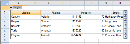
This example creates a multiple-column combo box cell and adds data from a data source.
| C# |
Copy Code
|
|---|---|
string conStr = "Provider=Microsoft.JET.OLEDB.4.0;data source=C:\\SpreadStudio\\Common\\Patients2000.mdb"; string sqlStr = "SELECT * FROM Patients"; System.Data.OleDb.OleDbConnection conn = new System.Data.OleDb.OleDbConnection(conStr); DataSet ds = new DataSet(); System.Data.OleDb.OleDbDataAdapter da = new System.Data.OleDb.OleDbDataAdapter(sqlStr, conn); da.Fill(ds); FarPoint.Win.Spread.CellType.MultiColumnComboBoxCellType mcb = new FarPoint.Win.Spread.CellType.MultiColumnComboBoxCellType(); mcb.DataSourceList = ds; mcb.DataColumn = 2; mcb.ColumnEdit = 2; mcb.ButtonAlign = FarPoint.Win.ButtonAlign.Left; mcb.ListAlignment = FarPoint.Win.ListAlignment.Right; mcb.ListWidth = 500; mcb.ListOffset = 5; mcb.MaxDrop = 5; fpSpread1.ActiveSheet.Cells[0, 0].CellType = mcb; |
|
| VB |
Copy Code
|
|---|---|
Dim conStr As String = "Provider=Microsoft.JET.OLEDB.4.0;data source=C:\SpreadStudio\Common\Patients2000.mdb" Dim sqlStr As String = "SELECT * FROM Patients" Dim conn As New System.Data.OleDb.OleDbConnection(conStr) Dim ds As DataSet = New DataSet() Dim da As New System.Data.OleDb.OleDbDataAdapter(sqlStr, conn) da.Fill(ds) Dim mcb As New FarPoint.Win.Spread.CellType.MultiColumnComboBoxCellType() mcb.DataSourceList = ds mcb.DataColumn = 1 mcb.ButtonAlign = FarPoint.Win.ButtonAlign.Left mcb.ListWidth = 500 mcb.ListOffset = 5 mcb.MaxDrop = 5 fpSpread1.ActiveSheet.Cells(0, 0).CellType = mcb |
|
Using the Spread Designer
- Select the cell or cells in the work area.
- In the property list, in the Misc category, select CellType. From the drop-down list, choose the ComboBox cell type. Now expand the CellType property and various properties are available that are specific to this cell type. Select and set those properties as needed.
Or right-click on the cell or cells and select Cell Type. From the list, select ComboBox. In the CellType editor, set the properties you need. Click Apply.
- From the File menu choose Apply and Exit to apply your changes to the component and exit Spread Designer.