You can display a check box in a cell using the check box cell. A check box cell can display a small check box that can have one of three states (checked, unchecked, or grayed) or two states (checked or unchecked). You can customize the check box by setting the text, determining the operation of the check box, and setting pictures in place of the standard check box pictures.
To create a cell that acts like a check box, use the CheckBoxCellType class. Create a check box cell using the procedure and example shown below.
Customizing Text
You can customize the check box by specifying the image for each of the states. By default, the check box has only two states, checked or unchecked, so to use all three you must set the ThreeState property. In the following table, default appearances are shown with text defined using the TextTrue, TextFalse, and TextIndeterminate properties. Clicking anywhere in the cell changes the check box state.
| State Appearance | Description |
|---|---|
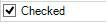 |
True (checked) |
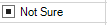 |
Indeterminate (grayed) |
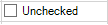 |
False (unchecked) |
You can customize the check box cell with these properties:
| Property | Description |
|---|---|
| Caption | Sets the text in the check box regardless of the state, overriding TextTrue, TextFalse, and TextIndeterminate text settings. |
| HotkeyPrefix | Sets whether the ampersand character underlines text and creates an access key. |
| TextAlign | Sets how the text is aligned in the cell with respect to the check box graphic. |
| TextFalse | Sets the text for the false state of the check box. |
| TextIndeterminate | Sets the text for the indeterminate state of the check box. |
| TextTrue | Sets the text for the true state of the check box. |
Customizing Pictures
For each state, you can also set custom pictures for each state of the check box cell (making it appear more like a button). You can determine the appearance of the check box according to whether the cell has focus (normal), does not have focus (disabled), or is being clicked (pressed).
| Property | Description |
|---|---|
| BackgroundImage | Sets the background image for the cell. |
| Picture | Sets the images to use for the states of the check box. |
| ThreeState | Sets whether the check box has three states |
Note that some graphical elements in certain cell types are affected by XP themes (visual styles). Setting the VisualStyles property of the Spread component to "off" can allow visual customizations of those graphical cell types to work as expected. For more information, refer to Using XP Themes with the Component.
For more information on the properties and methods of this cell type, refer to the CheckBoxCellType class.
For more information on the corresponding event when a user clicks on the check box, refer to the FpSpread.ButtonClicked event.
Using the Properties Window
- At design time, in the Properties window, select the Spread component.
- Select the Sheets property.
- Click the button to display the SheetView Collection Editor.
- In the Members list, select the sheet in which the cells appear.
- In the property list, select the Cells property and then click the button to display the Cell, Column, and Row Editor.
- Select the cells for which you want to set the cell type.
- In the property list, select the CellType property and choose the CheckBox cell type.
- Expand the list of properties under the CellType property. Select and set these specific properties as needed.
- Click OK to close the Cell, Column, and Row Editor.
- Click OK to close the SheetView Collection Editor.
Using Code
- Define the check box cell by creating an instance of the CheckBoxCellType class.
- Specify the properties of the check box cell, such as setting the check box to show three states using the ThreeState property for that CheckBoxCellType object.
- Enter the text that goes along with each check box, using the TextTrue, TextFalse, and TextIndeterminate properties.
- Specify the location of the images for the checked and unchecked boxes if you do not want to use the defaults, using the Picture property. (This is not done in the following example.)
- Assign the check box cell type to a cell or range of cells by setting the CellType property for a cell, column, row, or style to the CheckBoxCellType object.
Example
This example creates a check box cell.
| C# |
Copy Code
|
|---|---|
FarPoint.Win.Spread.CellType.CheckBoxCellType chkboxcell = new FarPoint.Win.Spread.CellType.CheckBoxCellType(); chkboxcell.ThreeState = true; chkboxcell.TextTrue = "Checked!"; chkboxcell.TextFalse = "Check"; chkboxcell.TextIndeterminate = "Not Sure"; fpSpread1.ActiveSheet.Cells[0, 0].CellType = chkboxcell; |
|
| VB |
Copy Code
|
|---|---|
Dim chkboxcell As New FarPoint.Win.Spread.CellType.CheckBoxCellType() chkboxcell.ThreeState = true chkboxcell.TextTrue = "Checked!" chkboxcell.TextFalse = "Check" chkboxcell.TextIndeterminate = "Not Sure" fpSpread1.ActiveSheet.Cells(0, 0).CellType = chkboxcell |
|
Using the Spread Designer
- Select the cell or cells in the work area.
- In the property list, in the Misc category, select CellType. From the drop-down list, choose the CheckBox cell type. Now expand the CellType property and various properties are available that are specific to this cell type. Select and set those properties as needed.
Or right-click on the cell or cells and select Cell Type. From the list, select CheckBox. In the CellType editor, set the properties you need. Click Apply.
- From the File menu choose Apply and Exit to apply your changes to the component and exit Spread Designer.