概述
ComponentOne 仪表板布局控件是2018V2版本新推出的动态布局控件,可让您设计动态屏幕和基于 .NET 的 BI 仪表板,为您提供强大的布局系统和更加灵活的数据分析能力。根据用户自定义的呈现方式来动态调整布局是这款控件的核心。此外,它还支持动态拖放,最大化和复原、保存和自动加载布局。
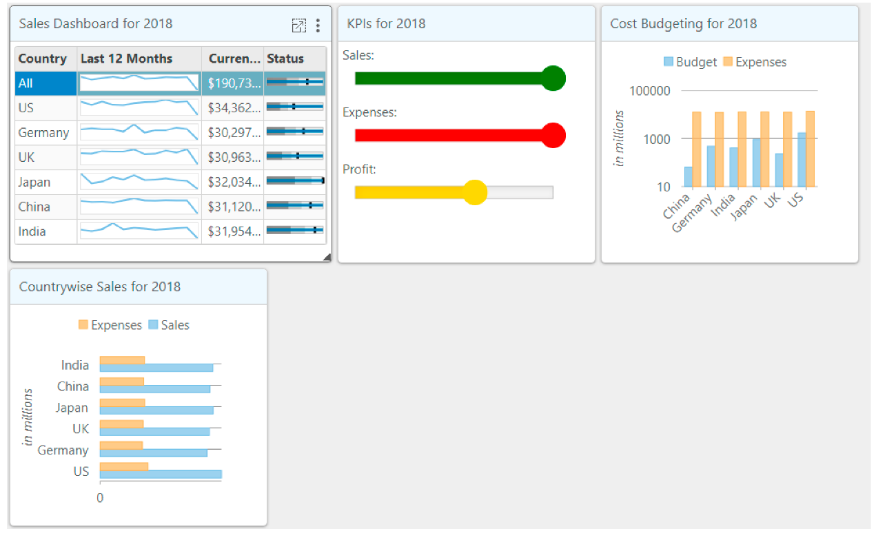
Dashboard layout for ASP.NET MVC
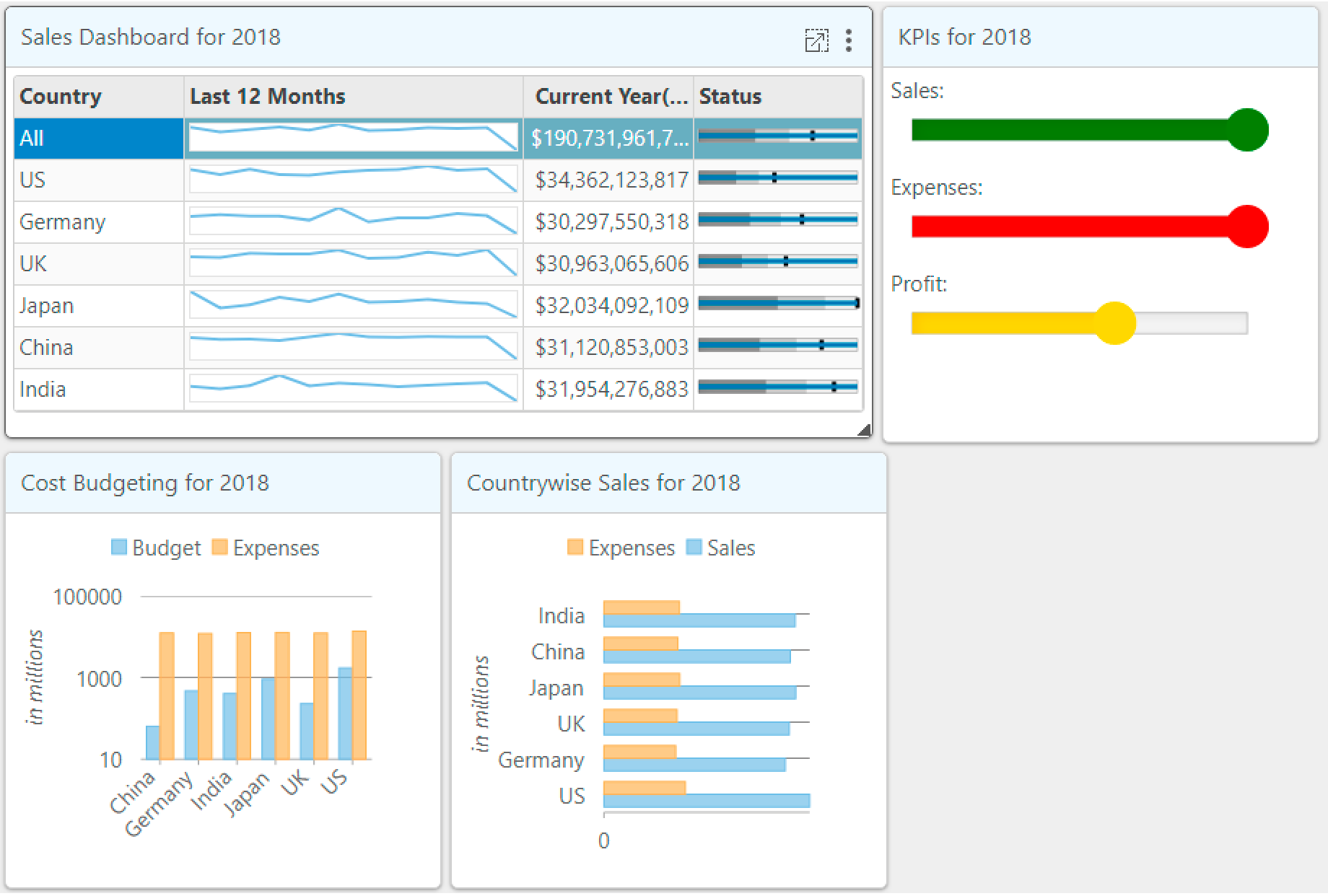
Dashboard layout 控件提供四种开箱即用的布局方式。开发人员可以使用C1 Dashboard Layout相应的 Flow,AutoGrid,ManualGrid 和 Split 布局元素设置它们。
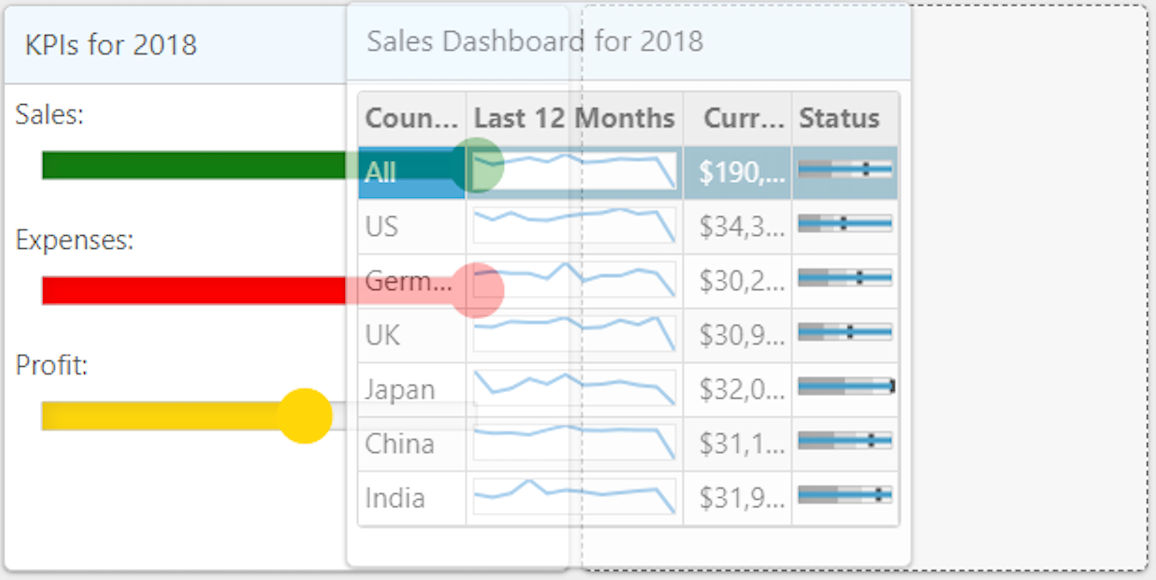
Dashboard layout 控件的四种布局方式
流程布局
Flow layout in dashboard layout
当 .NET开发人员使用 C1 Dashboard Layout 控件的流程布局时,它会根据direction属性将子容器排列为行或列。在默认情况下,项目流包裹在控件的边缘,因此当一个列/行结束时,另一个列/行会自动启动。
<c1-dashboard-layout id="dashboard">
<c1-flow-layout direction="LeftToRight">
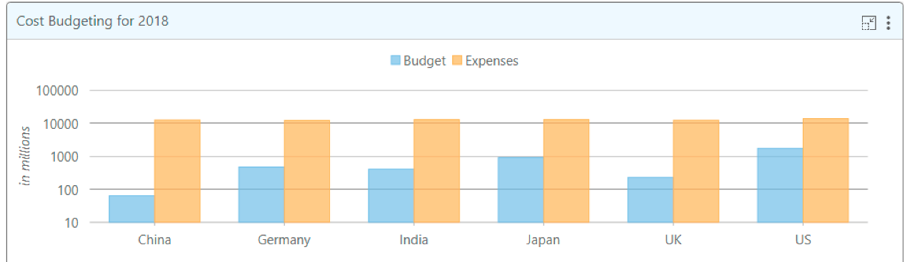
<c1-flow-tile header-text="@("Cost Budgeting for " + Model.CostBudgetingStr)" width="303" height="303">
<c1-flex-chart binding-x="Country" legend-position="Top" chart-type="Column" class="liContentChart">
<c1-items-source source-collection="@Model.CostBudgetingData"></c1-items-source>
<c1-flex-chart-axis c1-property="AxisY" title="in millions" format="g4,," log-base="10"></c1-flex-chart-axis>
<c1-flex-chart-series name="Budget" binding="Budget"></c1-flex-chart-series>
<c1-flex-chart-series name="Expenses" binding="Expenses" chart-type="Line"></c1-flex-chart-series>
<c1-flex-chart-tooltip content="<b>{seriesName}</b><br/>{x} {y:c0}"></c1-flex-chart-tooltip>
<c1-annotation-layer>
</c1-annotation-layer>
</c1-flex-chart>
</c1-flow-tile>
<c1-flow-tile header-text="@("Countrywise Sales for " + Model.CountrywiseSalesStr)" width="303" height="303">
<c1-flex-chart binding-x="Country" chart-type="Bar" legend-position="Top" class="liContentChart">
<c1-items-source source-collection="@Model.CountrywiseSalesData"></c1-items-source>
<c1-flex-chart-axis c1-property="AxisX" format="g4,," title="in millions"></c1-flex-chart-axis>
<c1-flex-chart-series name="Sales" binding="Sales"></c1-flex-chart-series>
<c1-flex-chart-series name="Expenses" binding="Expenses"></c1-flex-chart-series>
<c1-flex-chart-tooltip content="<b>{seriesName}</b><br/>{x} {y:c0}"></c1-flex-chart-tooltip>
<c1-chart-animation animation-mode="All" easing="Swing" duration="400"></c1-chart-animation>
</c1-flex-chart>
</c1-flow-tile>
</c1-flow-layout>
</c1-dashboard-layout>
该流程布局包含C1-flow-tile元素,可以包含任意内容,例如文本,HTML元素和MVC控件等。
自动表格布局
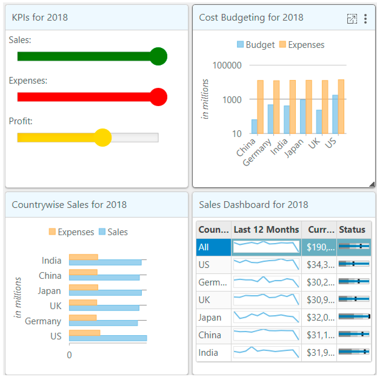
当您使用 C1 Dashboard Layout 的自动表格布局时,它会以表格形式排列项目,这些表格由 C1-auto-grid-group 组中的行和列组成。 每个C1-auto-grid-group 可以包含一个或多个 C1-auto-grid-tile 元素,这些元素同样可以包含HTML 脚本或 MVC 控件。
<c1-dashboard-layout id="dashboard">
    <c1-auto-grid-layout orientation="Vertical" max-rows-or-columns="3" cell-size="303">
        <c1-auto-grid-group>
            <c1-auto-grid-tile header-text="@("Cost Budgeting for " + Model.CostBudgetingStr)" row-span="1" column-span="1">
                <c1-flex-chart binding-x="Country" legend-position="Top" chart-type="Column" class="liContentChart">
                    <c1-items-source source-collection="@Model.CostBudgetingData"></c1-items-source>
                    <c1-flex-chart-axis c1-property="AxisY" title="in millions" format="g4,," log-base="10"></c1-flex-chart-axis>
                    <c1-flex-chart-series name="Budget" binding="Budget"></c1-flex-chart-series>
                    <c1-flex-chart-series name="Expenses" binding="Expenses" chart-type="Line"></c1-flex-chart-series>
                    <c1-flex-chart-tooltip content="<b>{seriesName}</b><br/>{x} {y:c0}"></c1-flex-chart-tooltip>
                    <c1-annotation-layer>
                    </c1-annotation-layer>
                </c1-flex-chart>
            </c1-auto-grid-tile>
            <c1-auto-grid-tile header-text="@("Countrywise Sales for " + Model.CountrywiseSalesStr)" row-span="1" column-span="1">
                <c1-flex-chart binding-x="Country" chart-type="Bar" legend-position="Top" class="liContentChart">
                    <c1-items-source source-collection="@Model.CountrywiseSalesData"></c1-items-source>
                    <c1-flex-chart-axis c1-property="AxisX" format="g4,," title="in millions"></c1-flex-chart-axis>
                    <c1-flex-chart-series name="Sales" binding="Sales"></c1-flex-chart-series>
                    <c1-flex-chart-series name="Expenses" binding="Expenses"></c1-flex-chart-series>
                    <c1-flex-chart-tooltip content="<b>{seriesName}</b><br/>{x} {y:c0}"></c1-flex-chart-tooltip>
                    <c1-chart-animation animation-mode="All" easing="Swing" duration="400"></c1-chart-animation>
                </c1-flex-chart>
            </c1-auto-grid-tile>
        </c1-auto-grid-group>
    </c1-auto-grid-layout>
</c1-dashboard-layout>
C1 自动表格布局的 orientation 属性指定是否要垂直或水平布置切片。当然,您也可以指定 max-rows-or-columns 属性以限制此值。
举个例子,如果当前布局方向是垂直的,则列数可限制为指定的数量,并且可以扩展多行。C1-auto-grid-tile 元素支持跨越多个单元。如果您需要在项目中启用此功能,请设置 row-span 和 column-span 属性。
手动表格布局
C1 手动表格布局类似于 Auto Grid 布局。但是,在手动表格布局中,开发人员可以指定放置每个 C1-manual-grid-tile 的行号和列号。
如果当前图块的行数和列数相同,它们将重叠。 注意:在自动表格布局中,这不会发生。
<c1-dashboard-layout id="dashboard">
    <c1-manual-grid-layout orientation="Vertical" max-rows-or-columns="3" cell-size="303">
        <c1-manual-grid-group>
            <c1-manual-grid-tile header-text="@("Cost Budgeting for " + Model.CostBudgetingStr)" row-span="1" column-span="1" row="1" column="3">
                <c1-flex-chart binding-x="Country" legend-position="Top" chart-type="Column" class="liContentChart">
                    <c1-items-source source-collection="@Model.CostBudgetingData"></c1-items-source>
                    <c1-flex-chart-axis c1-property="AxisY" title="in millions" format="g4,," log-base="10"></c1-flex-chart-axis>
                    <c1-flex-chart-series name="Budget" binding="Budget"></c1-flex-chart-series>
                    <c1-flex-chart-series name="Expenses" binding="Expenses" chart-type="Line"></c1-flex-chart-series>
                    <c1-flex-chart-tooltip content="<b>{seriesName}</b><br/>{x} {y:c0}"></c1-flex-chart-tooltip>
                    <c1-annotation-layer>
                    </c1-annotation-layer>
                </c1-flex-chart>
            </c1-manual-grid-tile>
            <c1-manual-grid-tile header-text="@("Countrywise Sales for " + Model.CountrywiseSalesStr)" row-span="1" column-span="1" row="2" column="1">
                <c1-flex-chart binding-x="Country" chart-type="Bar" legend-position="Top" class="liContentChart">
                    <c1-items-source source-collection="@Model.CountrywiseSalesData"></c1-items-source>
                    <c1-flex-chart-axis c1-property="AxisX" format="g4,," title="in millions"></c1-flex-chart-axis>
                    <c1-flex-chart-series name="Sales" binding="Sales"></c1-flex-chart-series>
                    <c1-flex-chart-series name="Expenses" binding="Expenses"></c1-flex-chart-series>
                    <c1-flex-chart-tooltip content="<b>{seriesName}</b><br/>{x} {y:c0}"></c1-flex-chart-tooltip>
                    <c1-chart-animation animation-mode="All" easing="Swing" duration="400"></c1-chart-animation>
                </c1-flex-chart>
            </c1-manual-grid-tile>
        </c1-manual-grid-group>
    </c1-manual-grid-layout>
</c1-dashboard-layout>
拆分布局
Split layout in dashboard layout
最后介绍的这种布局方式将会体现 C1 Dashboard Layout 布局控件为何被 .NET开发人员称为轻量级的交互式布局控件。当上述三种布局不能完全满足 .NET开发项目需求或者用户需要拆分布局时,这种类型的布局将会非常有效。 C1 拆分布局支持嵌套,即支持 C1-split-group 元素包含另一个具有与父级不同 Orientation 的 C1-split-group 元素。跟上面三种布局类似,每个C1-split-group 可以包含多个C1-split-tile,而每个 C1-split-tile 可以包含任何HTML脚本元素或 MVC 控件。
拆分布局支持动态调整,即每个拆分组中的项目可以调整为一个整体组,也可以单独调整到组内。
<c1-dashboard-layout id="dashboard">
    <c1-split-layout orientation="Horizontal">
        <c1-split-group orientation="Vertical">
            <c1-split-tile header-text="@("Cost Budgeting for " + Model.CostBudgetingStr)" size="*">
                <c1-flex-chart binding-x="Country" legend-position="Top" chart-type="Column" class="liContentChart">
                    <c1-items-source source-collection="@Model.CostBudgetingData"></c1-items-source>
                    <c1-flex-chart-axis c1-property="AxisY" title="in millions" format="g4,," log-base="10"></c1-flex-chart-axis>
                    <c1-flex-chart-series name="Budget" binding="Budget"></c1-flex-chart-series>
                    <c1-flex-chart-series name="Expenses" binding="Expenses" chart-type="Line"></c1-flex-chart-series>
                    <c1-flex-chart-tooltip content="<b>{seriesName}</b><br/>{x} {y:c0}"></c1-flex-chart-tooltip>
                    <c1-annotation-layer>
                    </c1-annotation-layer>
                </c1-flex-chart>
            </c1-split-tile>
            <c1-split-tile header-text="@("Countrywise Sales for " + Model.CountrywiseSalesStr)" size="*">
                <c1-flex-chart binding-x="Country" chart-type="Bar" legend-position="Top" class="liContentChart">
                    <c1-items-source source-collection="@Model.CountrywiseSalesData"></c1-items-source>
                    <c1-flex-chart-axis c1-property="AxisX" format="g4,," title="in millions"></c1-flex-chart-axis>
                    <c1-flex-chart-series name="Sales" binding="Sales"></c1-flex-chart-series>
                    <c1-flex-chart-series name="Expenses" binding="Expenses"></c1-flex-chart-series>
                    <c1-flex-chart-tooltip content="<b>{seriesName}</b><br/>{x} {y:c0}"></c1-flex-chart-tooltip>
                    <c1-chart-animation animation-mode="All" easing="Swing" duration="400"></c1-chart-animation>
                </c1-flex-chart>
            </c1-split-tile>
        </c1-split-group>
    </c1-split-layout>
</c1-dashboard-layout>
Dashboard layout 控件其他内置功能
拖放
Drag and drop controls in dashboard layout
支持开箱即用的拖放。用户将鼠标容器悬停在子容器上时,可以将子容器从一个位置拖到另一个位置,与此同时其他子容器会根据相应的布局规则自动调整。
最大化和还原
用户可以通过控件右上角的角标控制最大化和恢复子容器大小。在最大化子容器时,它像模型窗口一样覆盖父表面。您也可以使用相应的恢复图标进行恢复操作。
调整
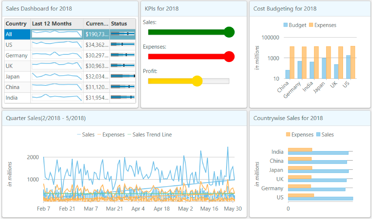
Resizing controls in dashboard layout
用户可以使用鼠标,沿容器边缘调整子容器的大小(如图所示)。调整控件大小时,可以使用右下角箭头。当对其中一个控件进行大小调整时,其他容器会根据可用空间自动进行调整。例如,在 Flow 布局中,当“2018的Sales Dashboard”进一步调整大小时,“2018的KPI”将移动到第二行。
保存&加载布局
Dashboard layout 控件提供了一个公共API,用于通过 saveLayout 和loadLayout 方法以 JSON格式将布局保存和加载到本地保存。 如果您需要保存特定布局和加载方式,或者保存成可能需要更改的布局样式,以便稍后进行加载,此功能将非常有用。
标题和工具
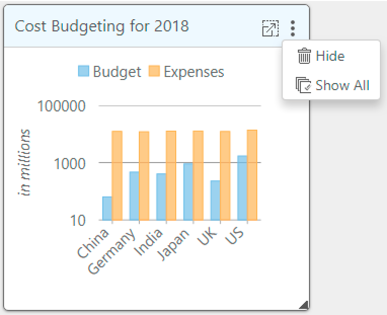
该控件支持子容器的可选标头、可配置工具栏和子容器的标题。此外,它还内置了对 Hide 和 ShowAll 子容器的支持。您可以通过在 formatTile 事件中向工具栏添加自定义菜单来定制工具栏。
下面是使用 formatTile事件自定义工具栏并添加 toolbarItem 控件,以导出图表的示例:
 <script type="text/javascript">
        function formatTile(dashboardLayout, e) {
            var tile = e.tile,
                toolbar = e.toolbar;
            if(tile.headerText == ('Cost Budgeting for ' + '@Model.CostBudgetingStr')){
                var strExportIcon = '<img style="vertical-align:middle" src="@Href("~/Content/images/icon_export.png")" alt="Export" title="Export" />';
                toolbar.insertToolbarItem({
                    icon: strExportIcon,
                    title: 'Export',
                    command: function () {
                        var selector = e.tile.content,
                            chart = wijmo.Control.getControl(selector);
                        chart.saveImageToFile(selector.substr(1) + '.png');
                    }
                });
            }
        }
</script>


