ComponentOne Chart for WinForms包含80多种2D和3D图表类型,无需代码的图表设计器,灵活的可定制的图表元素,最佳的视觉效果,可与最终用户的交互, 优秀的鼠标跟踪能力等。
使用ComponentOne Chart for WinForms可以提升数据分析系统。
本文从行业数据分析角度介绍C1Chart的图表,包含金融图表、数理统计、等高线和等高区域。上半部分主要讲述金融图表和数据统计两个部分。
金融图表
金融行业通常使用烛柱图展示价格波动或者通过HLOC图表展示股票走势。现在可以直接将ComponentOne提供的金融图表拖拽到WinForms应用程序中,向最终用户展示金融信息,并帮助最终用户作出决策。C1Chart金融图表的效果图如下所示:

设置C1Chart数据源:通过C1Chart.DataSource属性给它设置数据源。
设置C1Chart图表类型:金融图表通常需要使用烛柱图展示价格波动或者通过HLOC图表展示股票走势。这个可以通过C1Chart的ChartGroup.Group.ChartType枚举类型来实现。具体设置的代码如下所示:
ResetChart();
//设置金融表是烛柱图组合
            if (radChartGroups.Checked)
            {
                ChartGroup g = c1Chart1.ChartGroups.Group0;
                g.ChartType = C1.Win.C1Chart.Chart2DTypeEnum.Candle;
                g.ChartData.SeriesList[0].LineStyle.Thickness = 2;
                c1Chart1.ChartGroups.Group1.Visible = true;
                c1Chart1.ChartArea.AxisY2.Visible = true;
            }
//设置金融图表是HiLo开闭
            else if (radHiLoOpenClose.Checked)
            {
                c1Chart1.ChartGroups.Group0.ChartType = C1.Win.C1Chart.Chart2DTypeEnum.HiLoOpenClose;
            }
//设置金融图表是烛柱图
            else if (radCandle.Checked)
            {
                ChartGroup g = c1Chart1.ChartGroups.Group0;
                g.ChartType = C1.Win.C1Chart.Chart2DTypeEnum.Candle;
                g.ChartData.SeriesList[0].LineStyle.Thickness = 2;
            }
//设置金融图是HiLo
            else
            {
                c1Chart1.ChartGroups.Group0.ChartType = C1.Win.C1Chart.Chart2DTypeEnum.HiLo;
            }
数理统计
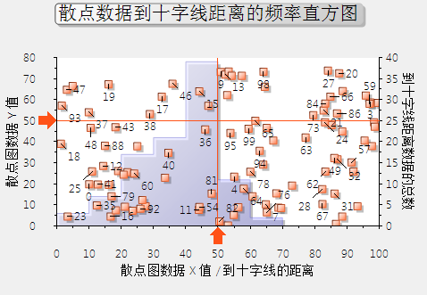
对于研究一组离散数据中蕴含的中数、众数、平均分布等等统计值时,C1Chart也能提供便利,使用散点图和直方图配合完成对一组离散数据的分析可以用于提供更大的便利,并有助于从数据样本中找到需要的信息。C1Chart数据统计直方图如下所示,这是散点数据到十字线距离的频率直方图。
建立C1Chart图表:在本文数理统计的demo中,用标记和散点数据在第一个ChartGroup建立C1Chart,并在第二个ChartGroup建立Histogram但并不添加数据。具体代码见附件Demo的Histogram。
建立C1Chart的Histogram:通过使用ChartHistogram对象的DisplayType属性,直方图、频率图、步进频率图的形式来显示间隔和数量。在Demo中,使用散列数据在第二个ChartGroup中建立Histogram,并且展示基于每个散列点的数据到标记的交叉之间的距离。代码参考如下:
//create a Histogram in the second chart group using the scatter data
            //and the distance from the marker intersection as data for the histogram.
            ChartGroup cg = c1Chart1.ChartGroups[1];

            //start by adding a Normal (Gaussian) distribution curve.  This is available
            //as a convenient reference to compare the histogram shape.
            NormalCurve nc = cg.Histogram.NormalDisplay;
            nc.FillStyle.Alpha = 64;
            nc.FillStyle.Color1 = Color.Yellow;
            nc.Visible = c1Chart1.ChartGroups[1].Histogram.NormalDisplay.Visible;

            cg.ChartType = Chart2DTypeEnum.Histogram;

            ChartDataSeries cds = cg.ChartData.SeriesList.AddNewSeries();
            cds.FitType = FitTypeEnum.Spline;
            cds.FillStyle.Alpha = 64;
            cds.FillStyle.Color1 = Color.Blue;

            cds.Histogram.IntervalCreationMethod = IntervalMethodEnum.SemiAutomatic;
            cds.Histogram.DisplayType = DisplayTypeEnum.Histogram;
            cds.Histogram.IntervalStart = 0;
            cds.Histogram.IntervalWidth = 10;
            cds.Histogram.IntervalNumber = 10;

            C1.Win.C1Chart.Label lab = c1Chart1.ChartLabels.LabelsCollection.AddNewLabel();
            lab.AttachMethod = AttachMethodEnum.DataCoordinate;
            lab.AttachMethodData.X = 100;
            lab.AttachMethodData.Y = 0;
            lab.AttachMethodData.GroupIndex = 0;
            lab.Offset = 50;
            lab.Name = "overflow";
            lab.Text = "";
            lab.Compass = LabelCompassEnum.South;
lab.Visible = true;填充Histogram数据:在Demo中,根据标记填充Histogram的数据。
//get the Target Coordinates
                double xtarget = carea.AxisX.ValueLabels[0].NumericValue;
                double ytarget = carea.AxisY.ValueLabels[0].NumericValue;

                //get the data point coordinates from the chart.
                ChartDataSeries cds = c1Chart1.ChartGroups[0].ChartData.SeriesList[0];
                PointF[] cdata = (PointF[])cds.PointData.CopyDataOut();

                //find the distance from each scatter point to the target point.
                int n = cdata.Length;
                double[] distances = (double[])Array.CreateInstance(typeof(double), n);
                for (int i = 0; i < n; i++)
                {
                    double dx = cdata[i].X - xtarget;
                    double dy = cdata[i].Y - ytarget;
                    distances[i] = Math.Sqrt(dx * dx + dy * dy);
                }

                //add the data to the Histogram chart series in ChartGroup(1).
                cds = c1Chart1.ChartGroups[1].ChartData.SeriesList[0];
                cds.Y.CopyDataIn(distances);

                //report the statistics of the distance data.
                lblStats.Text = "距离统计: " +
                    "  平均值: " + cds.Y.Statistics.Mean.ToString("0.000") +
                    "  中位数: " + cds.Y.Statistics.Median.ToString("0.000") +
                    "  标准偏差: " + cds.Y.Statistics.StdDev.ToString("0.000");

                //set the overflow label.
                int overflow = (int)cds.Histogram.AboveIntervalCount;
                string msg = "";
                if (overflow > 0)
                {
                    msg = "数量 > " + carea.AxisX.Max.ToString() + " = " + overflow.ToString();
                }
                c1Chart1.ChartLabels["overflow"].Text = msg;
至此,本文讲述了金融图表和数理统计图表,这些图表可以直观的帮助用户分析数据,在需要的领域快速做出决策。本文的下半部分将就等高线和等高区域图表作出讲解。
本文(上)的Demo源代码如下:
ComponentOne Enterprise | 下载试用
ComponentOne 是一套专注于企业 .NET开发、支持 .NET Core 平台,并完美集成于 Visual Studio 的第三方控件集,包含 300 多种 .NET开发控件,提供表格数据管理、数据可视化、报表和文档、日程安排、输入和编辑、导航和布局、系统提升工具等七大功能,被誉为“.NET开发的‘瑞士军刀’”。
ComponentOne 为您提供专业的产品咨询服务,并由技术支持工程师为您1对1解答。>> 发帖提问